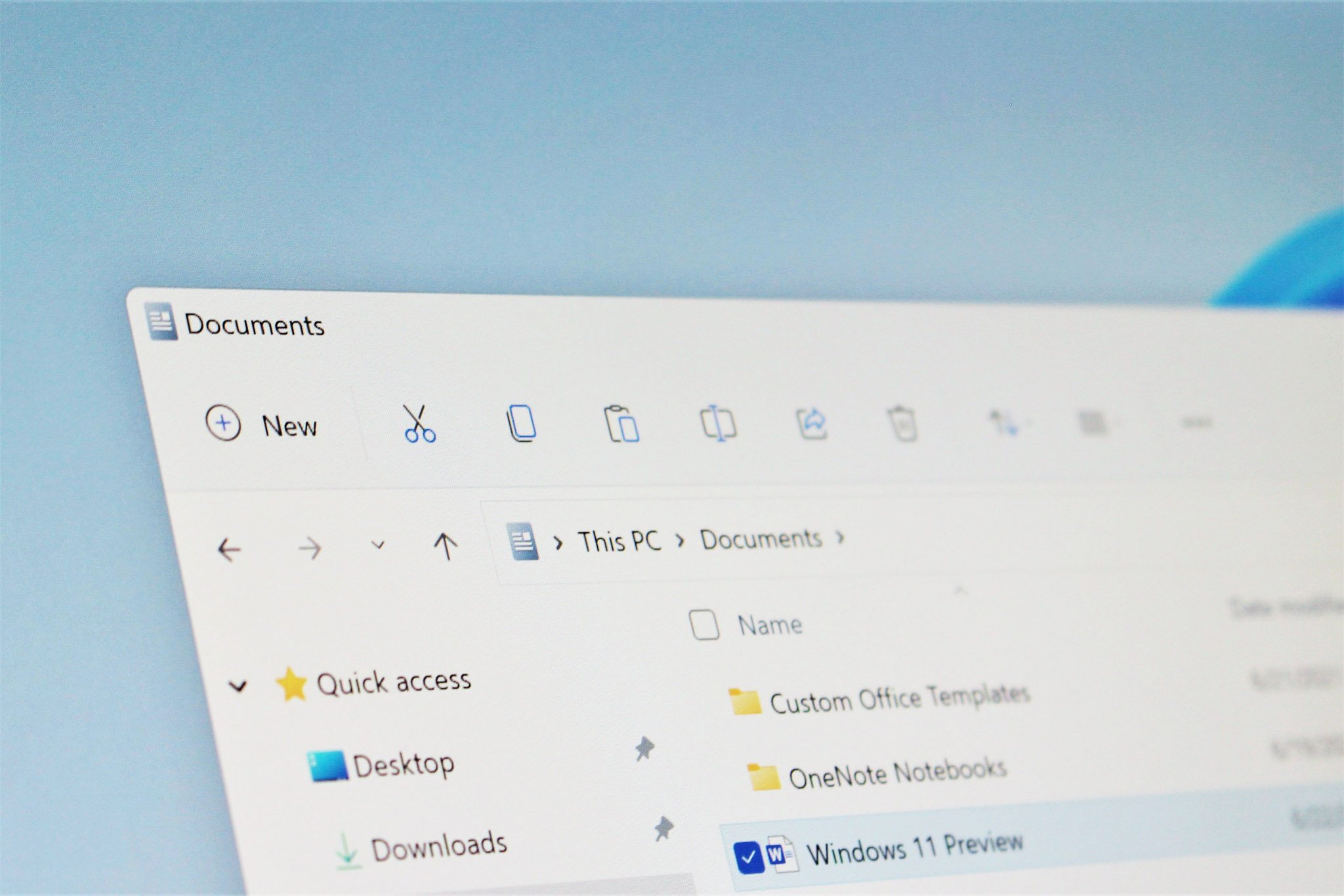
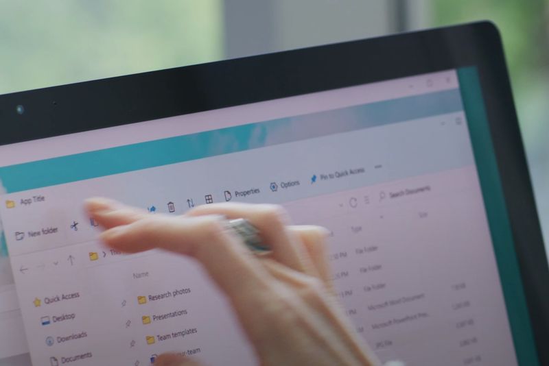
File Explorer has replaced its aging Ribbon UI with a new Fluent Design one.
What you need to know
- Microsoft has shown off a new File Explorer UI on Windows 11.
- It replaces the old Ribbon interface with a modern Fluent Design one.
- The UI is simplified with less text and more icons.
Microsoft has revealed a brief-look at a modern interface for the legacy File Explorer app that will be shipping as part of Windows 11 this fall. The new File Explorer appears to be the old one with a modern UI on top, and it looks fantastic.
The new UI looks to be based on WinUI, and features a clean and simplistic interface along the top of the explorer. Gone is the dated Ribbon UI interface that was introduced with Windows 8, and replacing it is a modern header with minimal buttons. It's a much cleaner looking interface, and perhaps less daunting to the average user too.
Annoyingly, the brief look really doesn't focus on the File Explorer itself, so we can only pull from a few frames.
On the left is a "New Item" button that likely provides quick access to creating a new folder or file. Alongside that are a bunch of icons that appear to resemble common tasks such as rename, copy, paste, delete, and share. Microsoft appears to be relying heavily on imagery instead of text with this new design.
The new File Explorer also includes modern context menus, which look much cleaner and less cluttered than the old context menus, although that isn't shown in the video. We'll have more to share about the new File Explorer design once Microsoft releases a preview build, sometime next week.
In the meantime, what are your thoughts on what we've seen of the new File Explorer UI so far? Let us know in the comments, and be sure to check out the rest of our Windows 11 coverage too.


No comments: