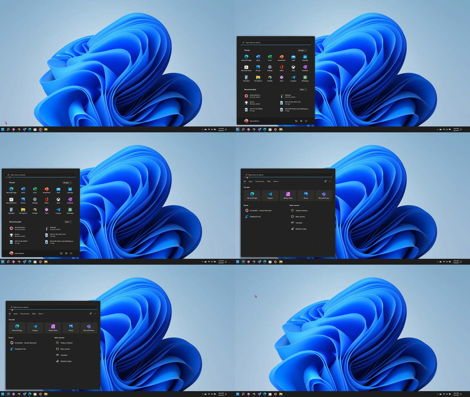
The search box in the Start menu has some Windows enthusiasts heated, but it's probably not worth getting mad about yet.
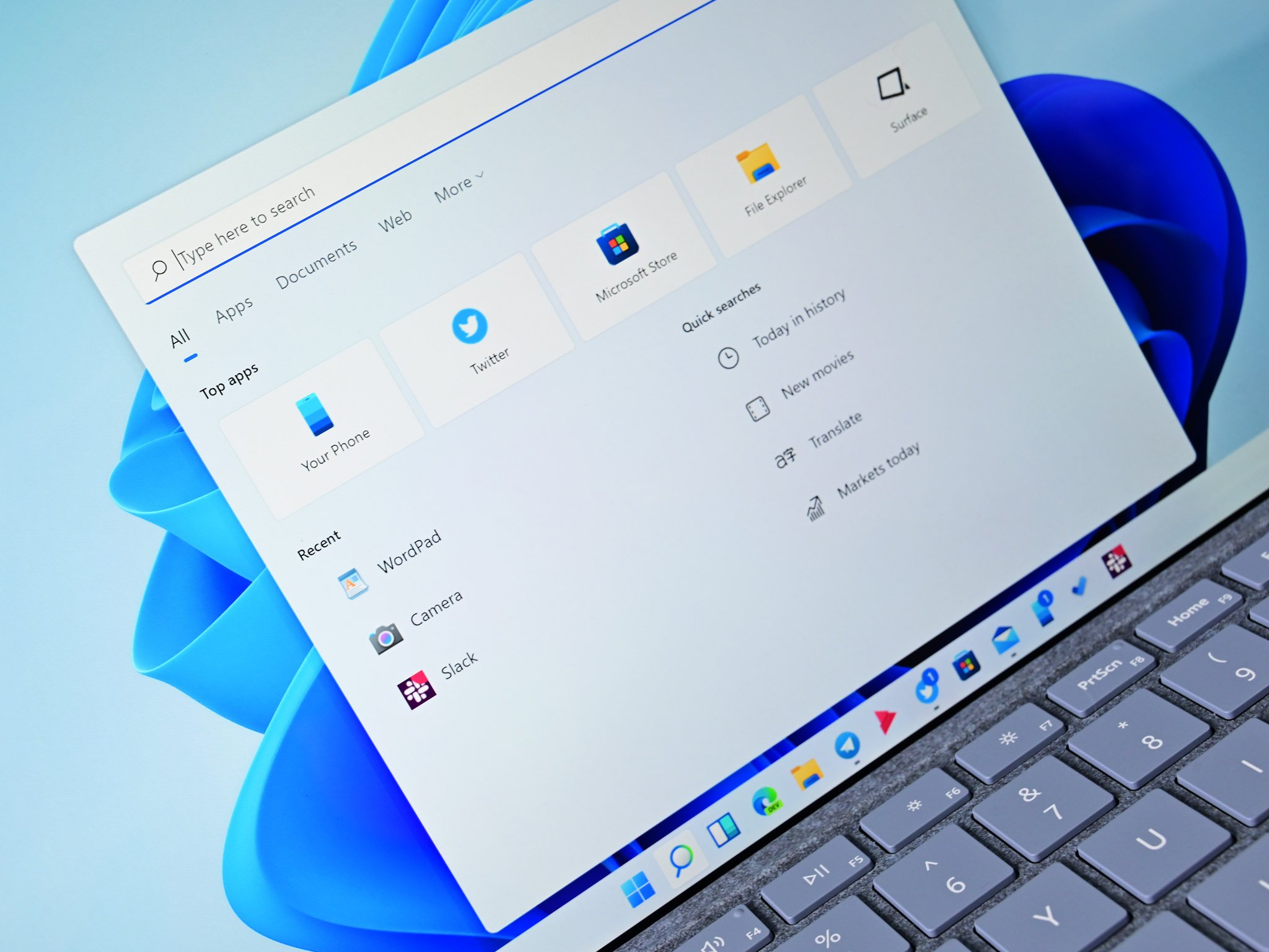
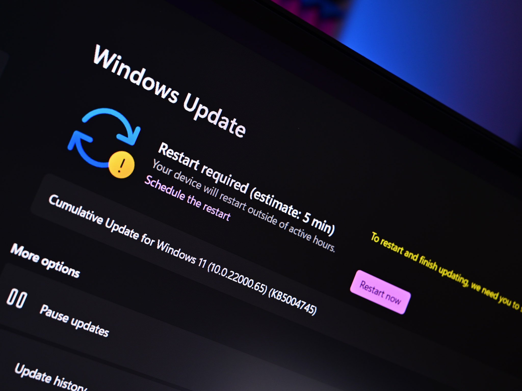
With Windows 11 build 2200.65, Microsoft got rid of the option to enable the old Windows 10 Start menu. While that change has caused a stir on the web, there's another update to the Start menu that has some people up in arms. In the latest build of Windows 11, Microsoft's added a search box to the Windows 11 Start menu.
It's always a bit funny to see people, including myself at times, up in arms about an icon or a feature in a preview build of an OS, but there are a few aspects of the search box coming to the Windows 11 Start menu that are worth breaking down.
Search within the Start menu isn't new
Windows has had a search box in the Start menu before. The Windows 7 Start menu that is beloved by many had a search box. And though Windows 10 didn't have a Start menu, it did have the option to search by typing after you click the Start button. In fact, typing after clicking the Start button has been a shortcut to search for multiple generations of Windows.
It is a bit redundant to have a search box within the Start menu when you can also have Search directly next to the Start menu. But some people prefer to have the Start menu act as a hub for multiple tasks. Others might not know that you can search for things from the Taskbar. Adding another search box helps in both situations.
The current UI is a bit odd

The current implementation of Search within the Start menu is janky. When you click in the text box for Search, the Start menu closes and the Search menu opens from the Taskbar. In a way, the search box in the Start menu isn't even a functional feature as much as another shortcut for searching from the Taskbar. For what it's worth, typing after pressing Start has the same janky jump from menu to menu at the moment.
I get why it's there. But for an OS which is meant to be obsessed over every detail, this doesn't really fit that. I can't think of a single instance in another OS where a search bar is used as a glorified button?
— Sam Williamson 🎮👨🏻💻 (@Telescuffle) July 8, 2021
But maybe it's just me🤷♂️
Windows 11 isn't finished
Sometimes we need to remind ourselves that this is a preview build of an operating system that's months away from shipping. Look at the number of changes that rolled out with just the most recent Insider build of Windows 11. The search box could move or be removed several times before the operating system ships. Microsoft also has time to refine the UI, such as having the Start menu transition smoothly to the Search UI rather than closing one menu and hopping over to another.
It could be great if the search ui appeared in the start menu pane.
— Rob C:\Segal (@robcsegal) July 8, 2021
Of course, people can be passionate about whatever they like, but it's worth putting this change into context. With months until Windows 11 comes out, this search box could be optional or in a very different state when most people see it for the first time.


No comments: