Why I think we should all chill out about Surface Duo's new camera bump
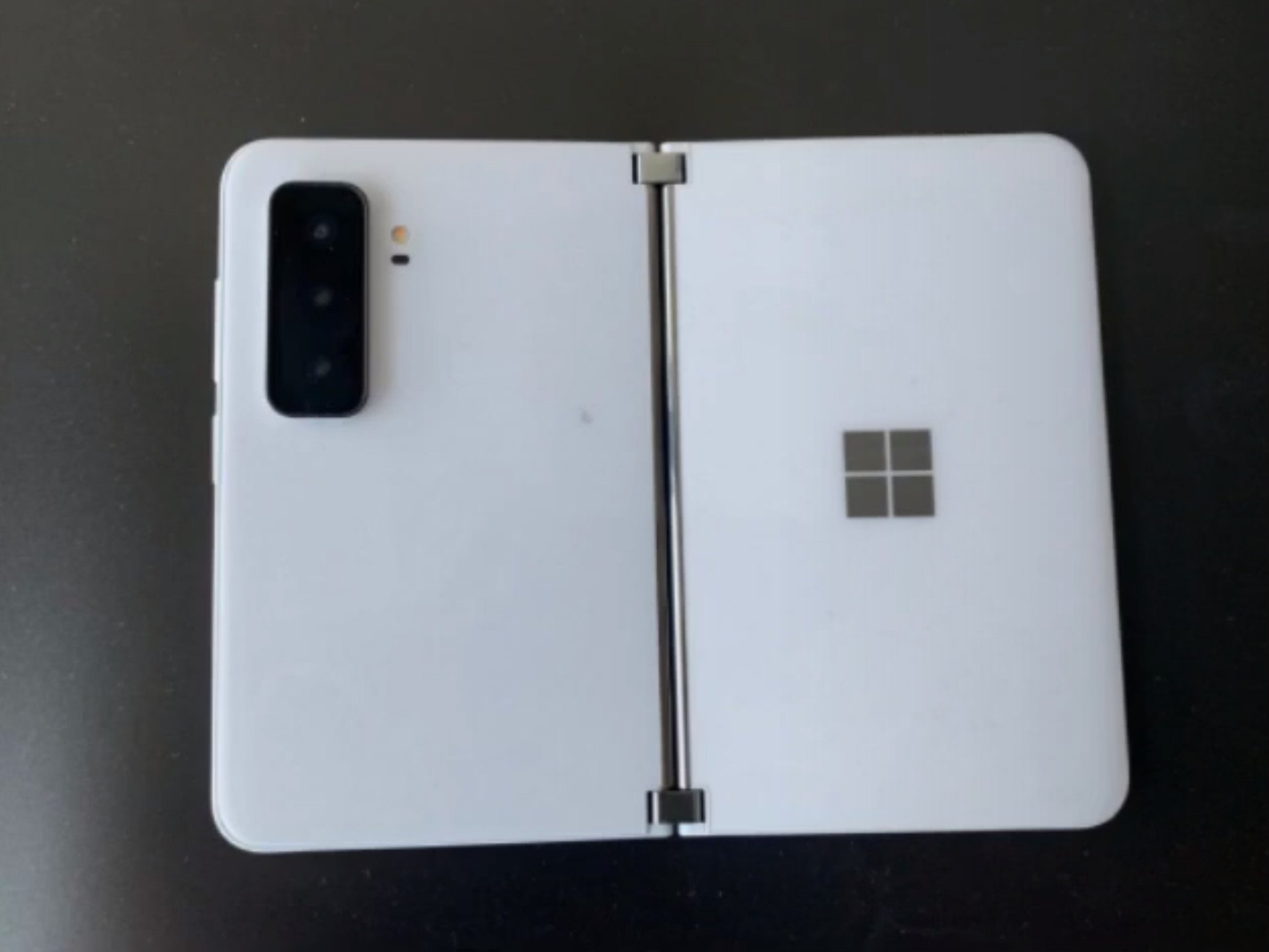
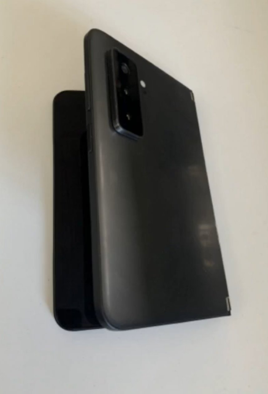
Yesterday, images of a near-final Surface Duo 2 handset leaked revealing that Microsoft's next dual-screen phone will finally include a competent triple-lens camera system housed in a very typical camera bump, just like other smartphones on the market. So far, however, response to these images has been somewhat negative, with comments critiquing how the camera looks out of place and now hinders the ability to lay the Duo flat on itself in single-screen mode.
Right off the bat, I want to quickly address some people's assumptions that the leak is fake or of an older prototype with an unfinished design. I'm told that isn't the case. My sources say that this prototype is the real deal and features the design that Microsoft intends to ship. We may see minor adjustments to things like materials and colors, but the camera bump, shape, and size is all set-in stone.
It's really hard to judge how good or bad a device is going to be based on leaked grainy photos. It's pretty much a fact that leaked photos always look worse than the real thing. When the iPhone 11 Pro first leaked, the design of the camera was polarizing, but then the device was announced and started shipping, and people got over it. I fully expect the same thing to happen with Surface Duo 2.
However, that doesn't address the usability problem in regard to using the device in single-screen mode. Yes, the camera bump will prevent the device from laying completely flat on itself, which on paper seems like a usability nightmare. But I bet this isn't as big of a deal as it seems. You can kind of simulate how this is going to look and feel on a Surface Duo 1 by placing a Surface Slim Pen between the two halves.
I tried this myself last night, and it's honestly a non-issue for things like typing or navigating the OS. In fact, I think it makes holding the Surface Duo a bit easier because you now have a thicker area to grab on to. Of course, the aesthetic of this isn't going to be to everyone's taste, but this is another thing most people will "get over" with time, and may even grow to like.
Would I prefer if it did lay flat? Of course. But is it the end of the world that it doesn't? I really don't think so.
There are also structural concerns about whether or not the camera bump could possibly bend or break when closing the two sides together. Again, a legitimate concern, but I feel like Microsoft would already have tested this extensively. I would bet that if it was a problem, Microsoft wouldn't be shipping the device with this design. Still, this is one of those "we'll have to wait and see" kind of things.
Just like the Surface Book
This all reminds me of when Microsoft announced the first Surface Book. When that was announced, the design around the hinge and the fact that the lid wouldn't close flush with the keyboard deck was a real concern for people. Some people found it ugly, others were worried about whether the gap would let in dirt or allow the lid to bend over time.
It turned out, none of those concerns were a problem. We're now on the third-generation Surface Book five years in, and not one person is questioning the structural design of the hinge or lid anymore. It's just how it is, and I think a lot people have actually grown to like it. I think we're going to see the exact same thing happen with Surface Duo 2.
Sure, it's annoying that the first-generation Surface Duo can sit flush and the second one can't, but it's also annoying that the first-generation Surface Duo can't take good photos. As someone who isn't even that into smartphone photography, I still want better cameras on my Surface Duo. I want an ultrawide lens, and I want to be able to take photos quickly without having to fold the device into a specific mode first.
I think a lot of people complaining about the Surface Duo 2 camera have never actually used a Surface Duo 1. As someone who has daily driven a Surface Duo since September 2020, I can tell you that a camera system on the outside of the device is going to be so much better. The single camera on the inside is a nightmare to use, and I've missed many photo opportunities because of it.
It's pretty clear to me that Microsoft is trying to make Surface Duo 2 a good phone. Surface Duo 1 nailed the fundamentals of being a Surface, but it wasn't a good phone. The poor camera, lack of NFC, 5G, high-refresh displays, and an outdated processor were all reasons why the device wasn't a good phone. That, and the fact that the OS was (and is) incredibly buggy.
For Microsoft to make Surface Duo 2 a good phone, it needs to address these concerns. And luckily, it appears to be doing so. It will have a better camera, but the only way to do that is to add a camera bump, as the Duo itself is too thin to house any competent camera system inside the body. So this is literally the only thing they can do without sacrificing something else such as battery life or overall device thickness.
The original Surface Duo set out to be a device that excels in productivity, multitasking, and inking. That doesn't change with the Surface Duo 2 and its camera bump. It's still a dual-screen device, and it's still the only good one on the market. Sure, you won't be able to fold it completely flat on itself in single-screen mode anymore, but if that's a showstopper for you, then maybe you're not the target demographic for a device like the Duo anyway.
As a Surface Duo 1 customer, I am very excited about Surface Duo 2. I think, if Microsoft can nail the software, this will be the first Surface Duo I can comfortably recommend to "normal folks" who may be mesmerized by mine when they see me using it in a public setting. We expect Surface Duo 2 to begin shipping in September or October, though we don't yet know how much it'll cost.


No comments: