Windows 11 has been in testing for about a month, which is enough time to fall in love with a few things and learn to hate a few more.
Windows 11 entered public testing last month. Several of our writers here at Windows Central downloaded the first public preview build of Windows 11 and have tried the operating system out since. There are several things we love about the new OS and some things that we either hate or just aren't too fond of.
Windows 11 isn't finished, but it's far enough along that we can assess some key areas that draw out some passion. I reached out to the team to get their thoughts on Windows 11 so far.
Love: Delightful design improvements
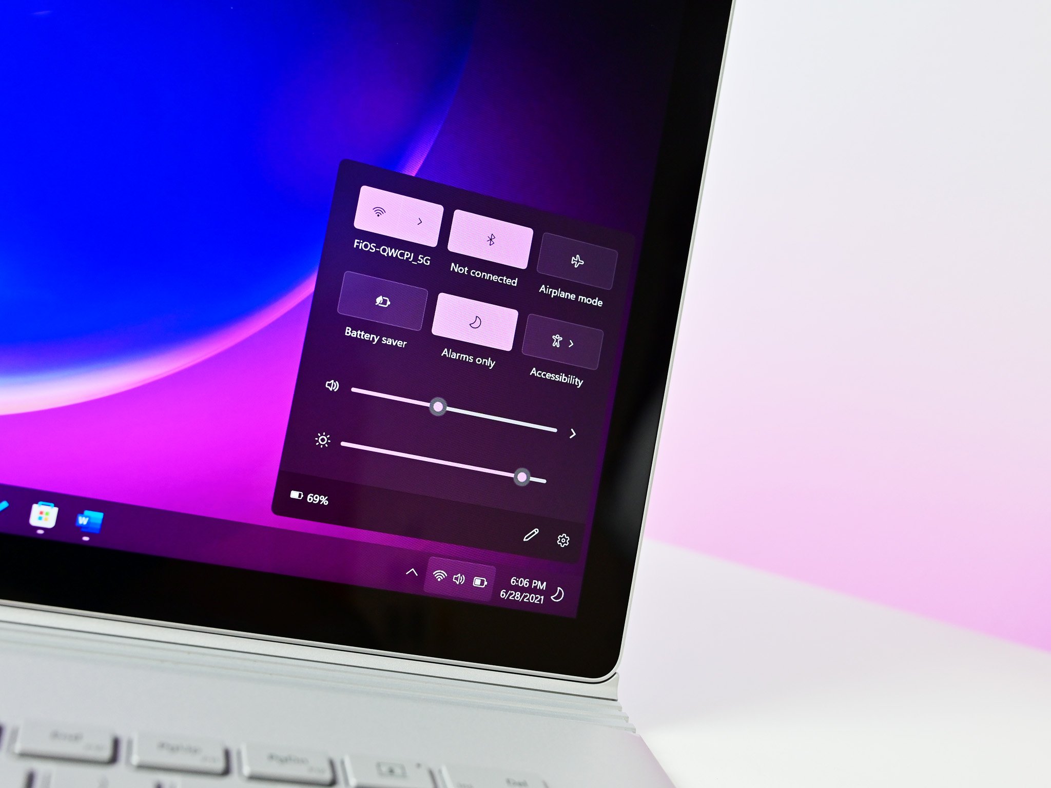
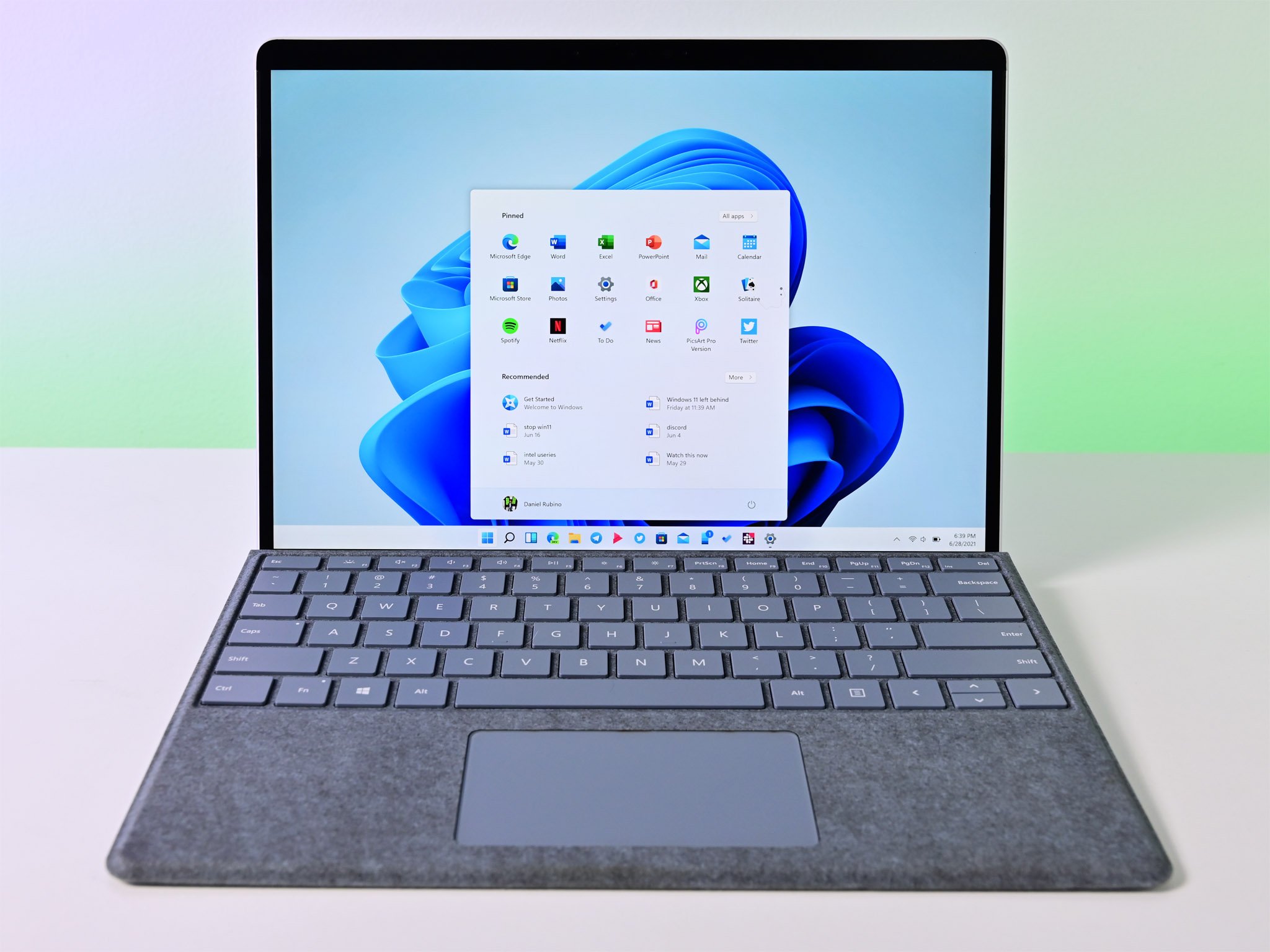
While Windows 11 isn't completely finished, it brings a long list of overhauled, improved, and tweaked design elements. It's not just about rounded corners, though those are quite popular. More uniform context menus, a design language that extends across several parts of the OS, and the modernization of Windows are part of a long-overdue visual refresh.
Last month I wrote about how I haven't been this excited about Windows 11 for years. While much of that excitement is about new features, it's also just exciting to try something out that feels new. Navigating through Windows 11 feels more fluid and consistent while using the best laptops and other PCs. It makes it exciting to be an Insider again.
Hate: Remaining inconsistencies and UI issues
While Windows 11 has come a long way in terms of design improvements, there are still some inconsistencies. Just as an example, there are still multiple styles of context menus on the operating system. If you right-click with Edge, you see a design from Windows 10. If you right-click the desktop, you see a new design from Windows 11 with rounded corners.
The silver lining to the cloud of inconsistencies and UI problems is the fact that Microsoft could change these before the operating system comes out. The company is clearly moving towards a unified design, even if it isn't there yet. With months to go before Windows 11 ships, there's a good chance some of these issues will be fixed.
Love: Microsoft Store makeover
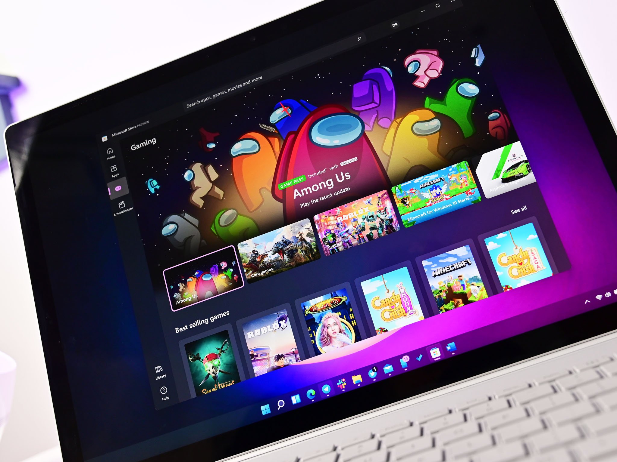
The Microsoft Store has been a sore spot for Windows for years. I know several people that never use it or don't even know that it exists. Microsoft aims to change that with Windows 11. The new Microsoft Store has a refreshed look and also seems to run better (#SeemsFaster).
Microsoft also showed a new commitment to the Microsoft Store with Windows 11. A new revenue-sharing model, support for Android apps in the Microsoft Store, and new ways for developers to get their apps into the store have already shown early returns. Zoom, OBS, WinZip, TikTok, and several other apps have already made their way to the new Microsoft Store. As a result of Microsoft's efforts, the new Microsoft Store looks better, works better, and has more apps in it than ever.
Hate: The new Start Menu (kind of)
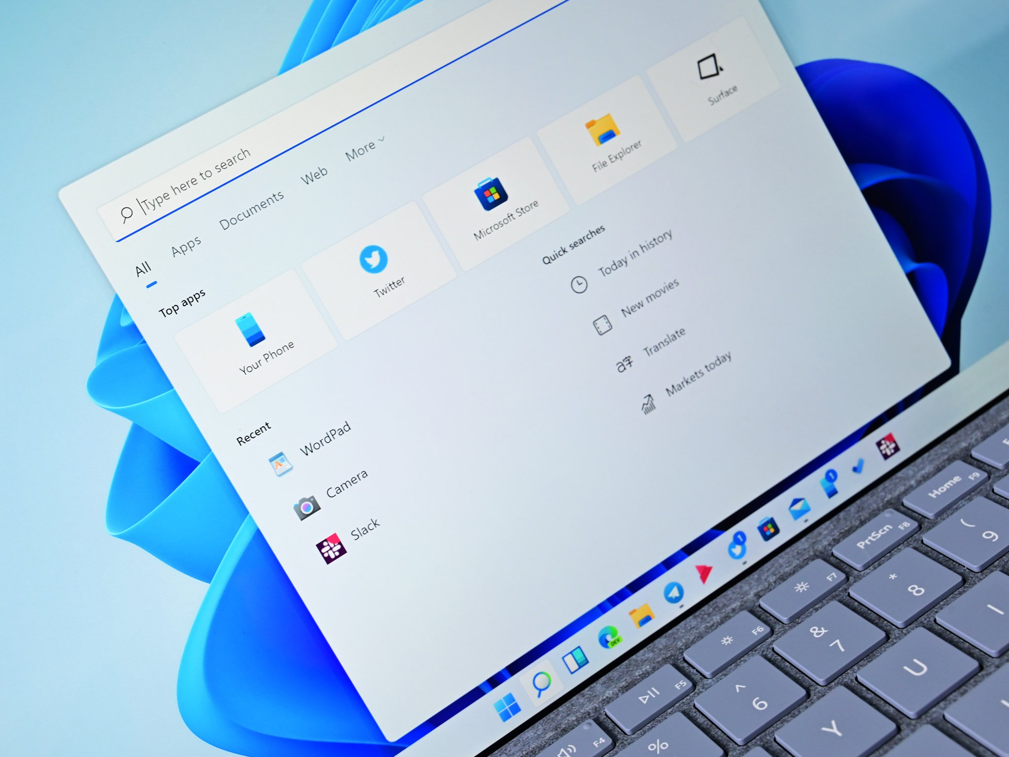
The Windows 11 Start menu was controversial from the start, pun intended. While many lament the loss of Live Tiles, I'll focus on some other changes — or lack of changes — that we don't love.
When you first install Windows 11, the Start menu is full of apps that you don't want or don't even have installed. These are essentially ads. I understand why Microsoft does this, but that doesn't mean I like it. Just let me have the apps I want in the Start menu from the get-go.
Speaking of apps that I want and use, why has Microsoft hidden all of my apps behind another button? Instead of being able to scroll down to see all of my apps, I now have to click a button and scroll through a list. This is a move backward compared to Windows 10.
Personally, I like the new Start menu, but I don't like Microsoft cramming unwanted ads into it or making it more difficult to reach the apps I use on a regular basis. I know I'm not alone in that sentiment.
Love: Snapping feels good
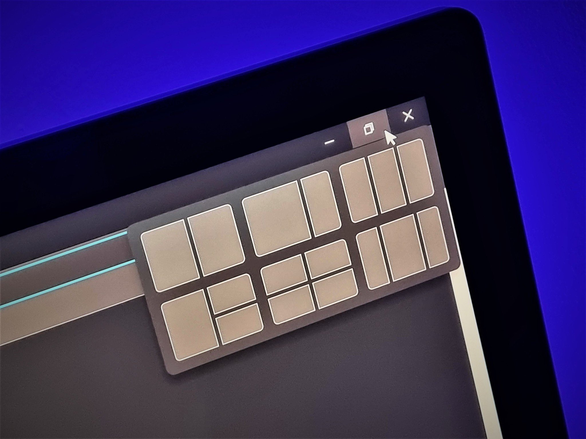
As someone who uses multiple monitors and almost always has several windows open, the snapping improvements in Windows 11 bring a major boost to productivity. Microsoft took some of the best ideas from PowerToys for snapping Windows and baked them right into the operating system.
When you hover over the maximize button on any window, you're presented with different snapping layouts. Not only can you select a layout, but you can also select a specific portion of the layout that you want a window to pop into. For example, you could hover over the maximize button for Twitter and have the app take up the right third of your screen. You can then populate the rest of the snapping sections with other apps.
This is a natural evolution of Windows 10 and should be a welcome change for multitaskers.
Hate: Not being able to test it
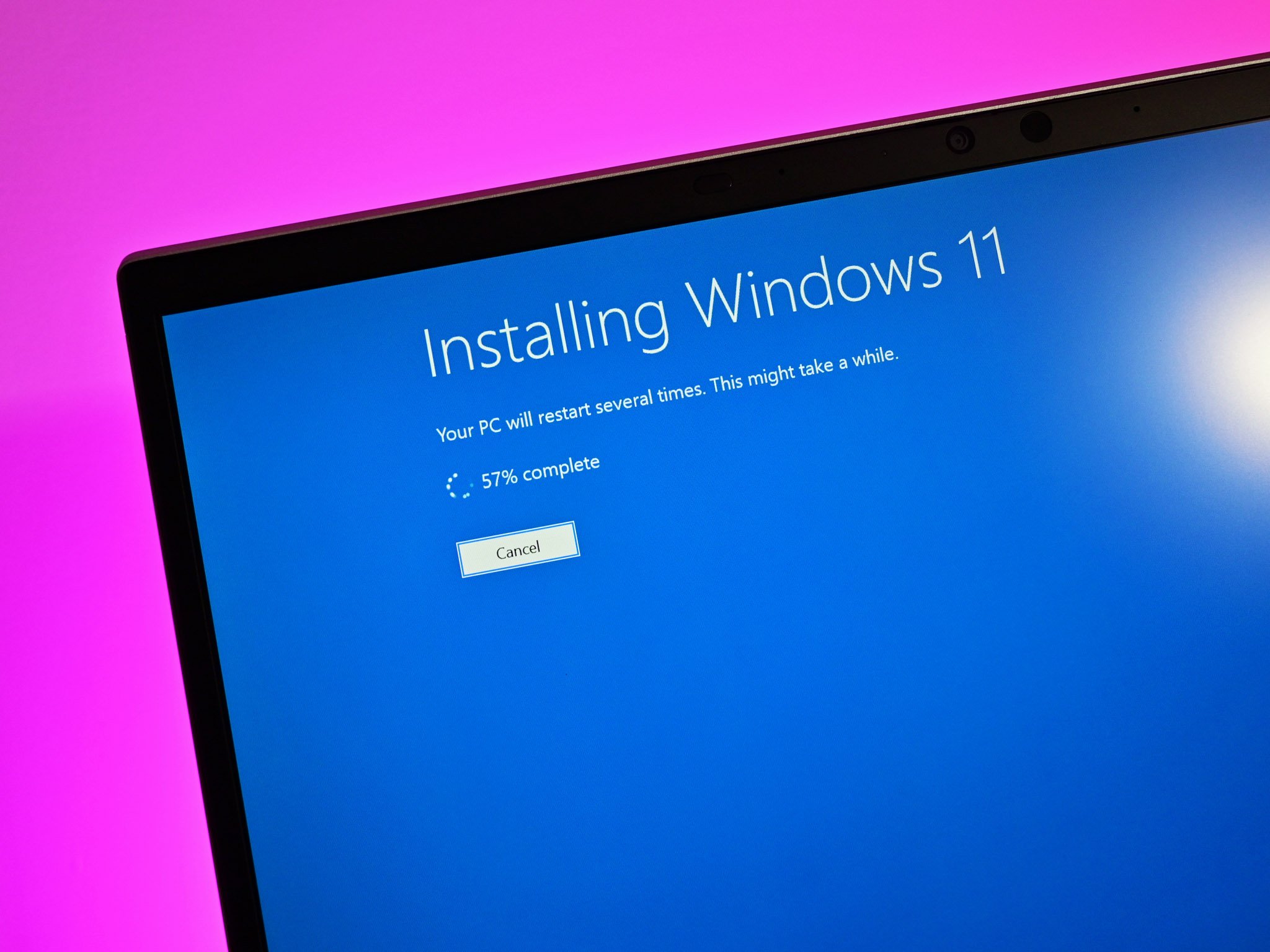
While many members of our team have used Windows 11 for weeks, a few haven't been able to test the operating system at all. Due to the minimum requirements of Windows 11, even some modern PCs can't run the new OS. Microsoft allows some long-time Insiders to test Windows 11 out on older hardware, but that doesn't help everyone. Additionally, it wouldn't fix the fact that a person's PC won't be able to run the OS after its general release.
This problem likely won't go away as Windows 11 moves to general release. Since the announcement of Windows 11, the minimum requirements of the operating system have drawn the most attention, almost all of which has been negative. Microsoft's "tone deaf" response to the situation hasn't smoothed things over either.
No comments: